Your Wellbeing Anywhere

The Geras App, dedicated to enhancing the well-being of the elderly, was already making strides in providing valuable health data to its users. As the app's user base expanded, the need for a more refined User Experience became evident to accommodate this growing audience. This led to my collaboration with the Geras team, where my role was to reimagine and redesign the app to be more intuitive and user-friendly. The outcome was a significant improvement in performance, contributing to Geras evolving into a $5M company and extending its reach to over 5,000 users across the USA.
Introduction
Why was a redesign needed?
The mobile app was designed by a non designer with limited UI/UX knowledge, which lead the app to be not user friendly. The last version failed major UX heuristics, making the product’s clarity and discoverability complex.
As per the data, users faced accessibility issues and a substantial cognitive load while using the platform. Information was displayed in a way that poorly conveyed the use of the product, making many users not sure of the how the product worked The visuals were inconsistent, making the design cluttered, difficult to navigate, unclear design language and unreadable text size and typeface
The Process
Product Discovery, User Research, and improved IA
Wireframing
Visual and Conceptual Branding
New Features for better discoverability and more engagement
Approach To The Solution
Use minimal design to prevent cognitive issues in senior citizens
Avoid irrelevant content on the screen
Provide clear instructions on how to use the app
Provide only those features that the person requires
It should have simple and easy navigation
Limited gesture control within the app
The Redesign
Shown below is a side by side comparison of the old and redesigned version of the website. Some of the key changes include improved information architecture as well as a minimalistic design with consistent visuals.
Registration
Home
Plans
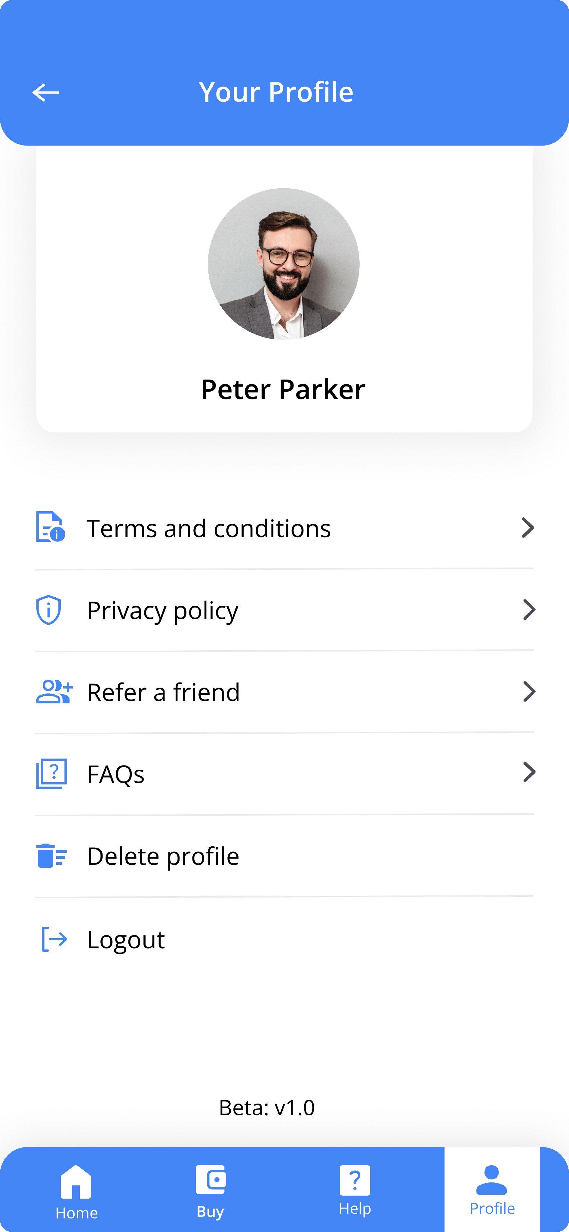
Profile
Camera
Before
After

Before
After


Before
After


Before
After


Before
After


The Design Process
Content Audit
Previous State
I started off the project by mapping out the current information architecture of the website and worked with the team to change the layout of information in a way that is more intuitive and user-friendly. Below are the screens of the app, and below them the sections of the corresponding screens outlined. This was done in order to ensure that once the user visits the app, they can find the information they need quickly and in an easy to understand manner.
Start
Health Monitoring
User Details
Free
Scan Via Finger
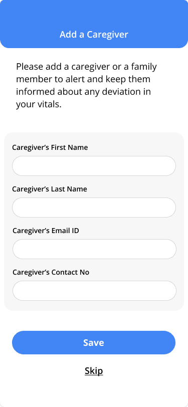
Add Caregiver
Standard
Vitals
Subscription
Care Services
Registration
Profile
Home
Registration
Login
Scan Results
New State
After analysing the previous app state, it became apparent that the app would benefit from a restructuring. We moved some of the sections, we added to further create an intuitive and easy to navigate the app. For example, we noticed from our research that users were having difficulty understanding how the app works, so we added a separate page for new users with detailed navigations, so that they can easily find out more information about how to use the platform.
Start
Health Monitoring
User Details
Freemium
Scan Via Finger
Caregiver
Details
Pay as
you go
Scan via Face
Add Caregiver
Standard
Search
Vitals
Subscription
Care Services
Splash Screens
Registration
Profile
Home
Welcome Screens
& Login
Login
Using Google
Using Facebook
Using Apple ID
Mental
wellness
Scan Results
Laying out the Content
After identifying the updated content structure for the app, I began wireframing how this content could be put into sections. The focus for this exercise was to showcase the content in a way that met both business goals (getting users to join focus rooms) and user goals (gaining an understanding of how the platform works). Once the layout was identified in a way that prioritized important content and created a user friendly experience, I dove in to high fidelity designs to focus on the visuals. The final designs can be found under the redesign section.
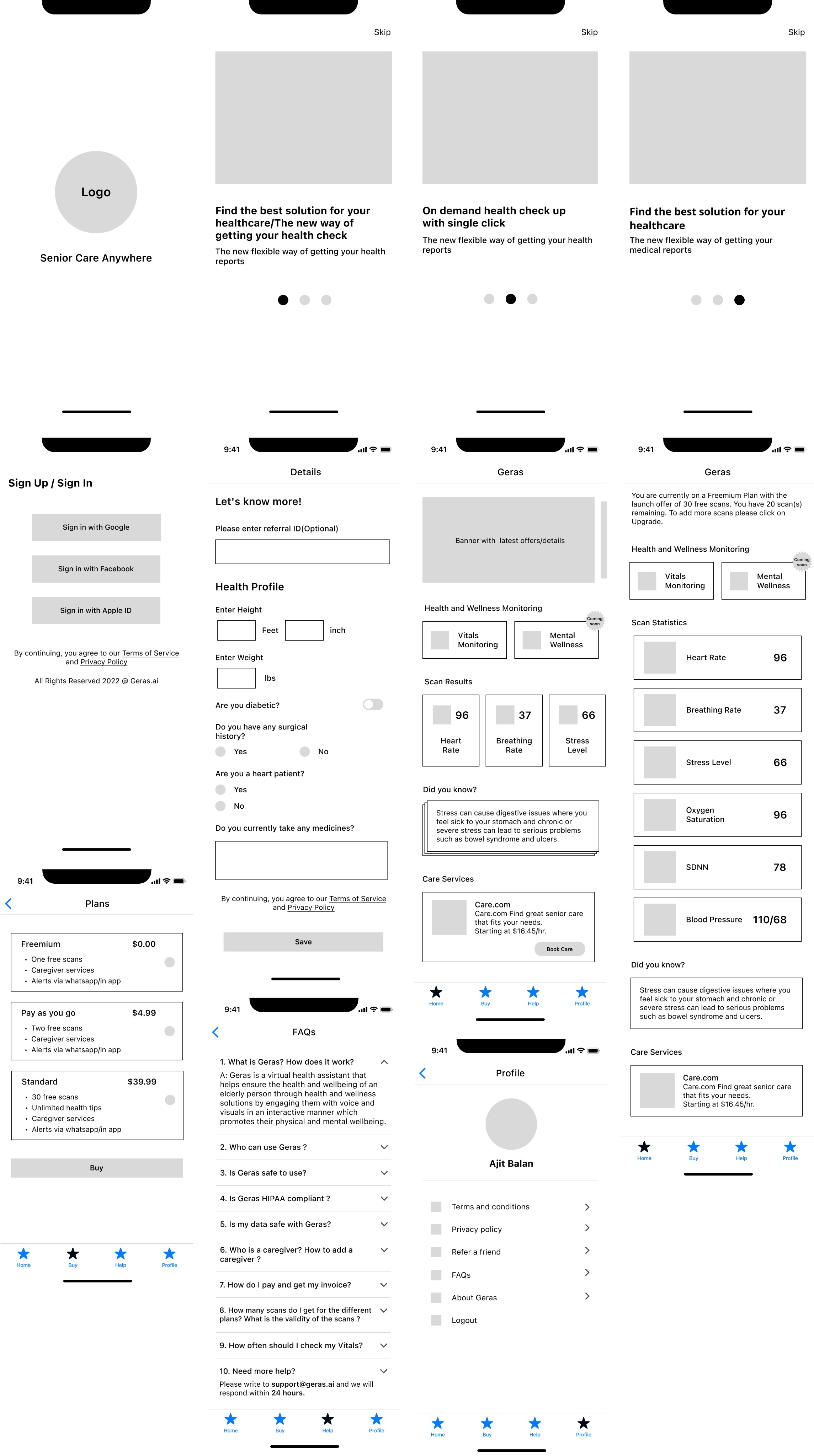
Final Designs
Here are the final designs for the app, after applying the visual identity.

The Project Learnings
The most challenging points in the project
The most challenging part was researching the brand, collecting demographics, data, vision, etc. Geras.ai’s previous app experience made many people not want to use it, and finding those who did was difficult, so I had to look for outside sources. A lot of research was done on the internet due to lack of the users.
Reflection and lesson learned
Looking back on the whole process, redesigning the Geras.ai app, and working on this case study reminded me that users are always the centre of every design decision and the impact the smallest of things can have, such as changing an element's position.
I learned how to work with the stakeholder to provide evidence of data to support design decisions, such as colours, and focus on the most critical problems to solve.
With more time, I would love to work on the accessibility of the Geras.ai app. Most notably:
Colour contrasts to be able to read for the colour blind and aged eyes.
Keyboard control to be able to navigate with easy taps.
Content accessibility parses all images and videos to provide alternative text, captions, and audio descriptions.